


Food Photography Props
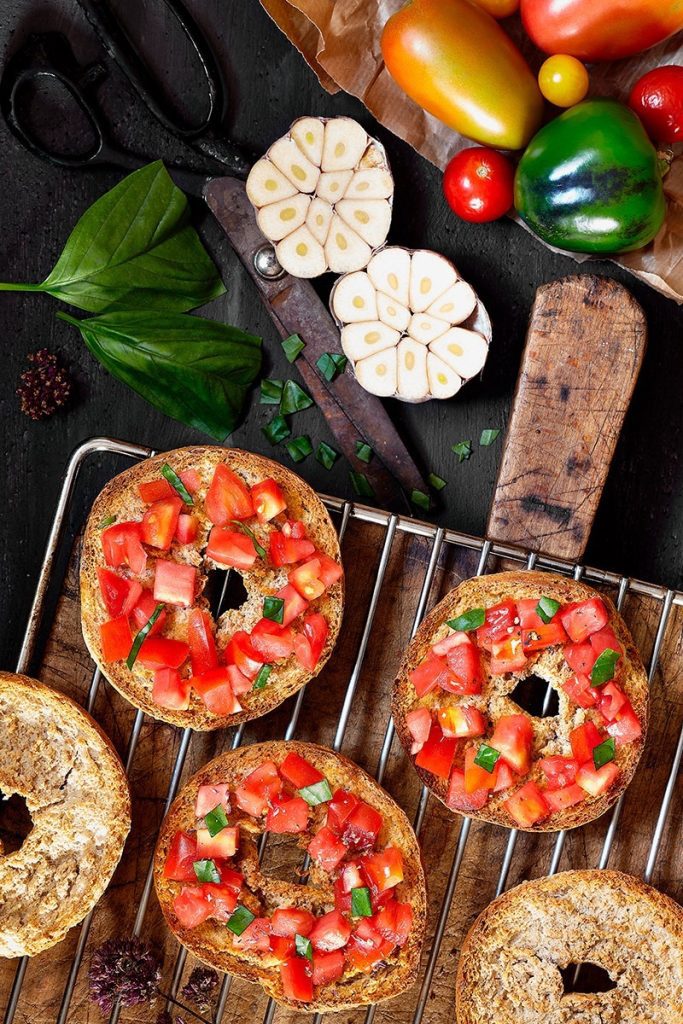
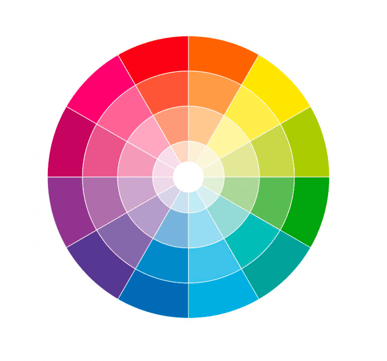
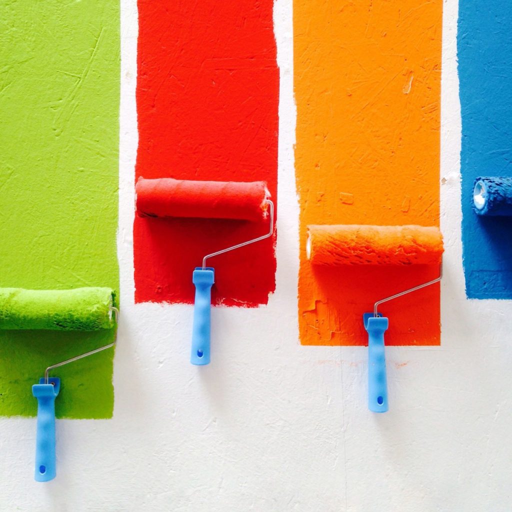
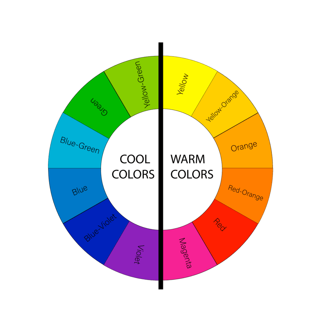
Food photography is an art that demands not only technical skill but also a creative eye for composition. A key ...
Showing Slide 1 of 2
FOOD PHOTOGRAPHER | MULTIDISCIPLINARY ARTIST | STORYTELLER
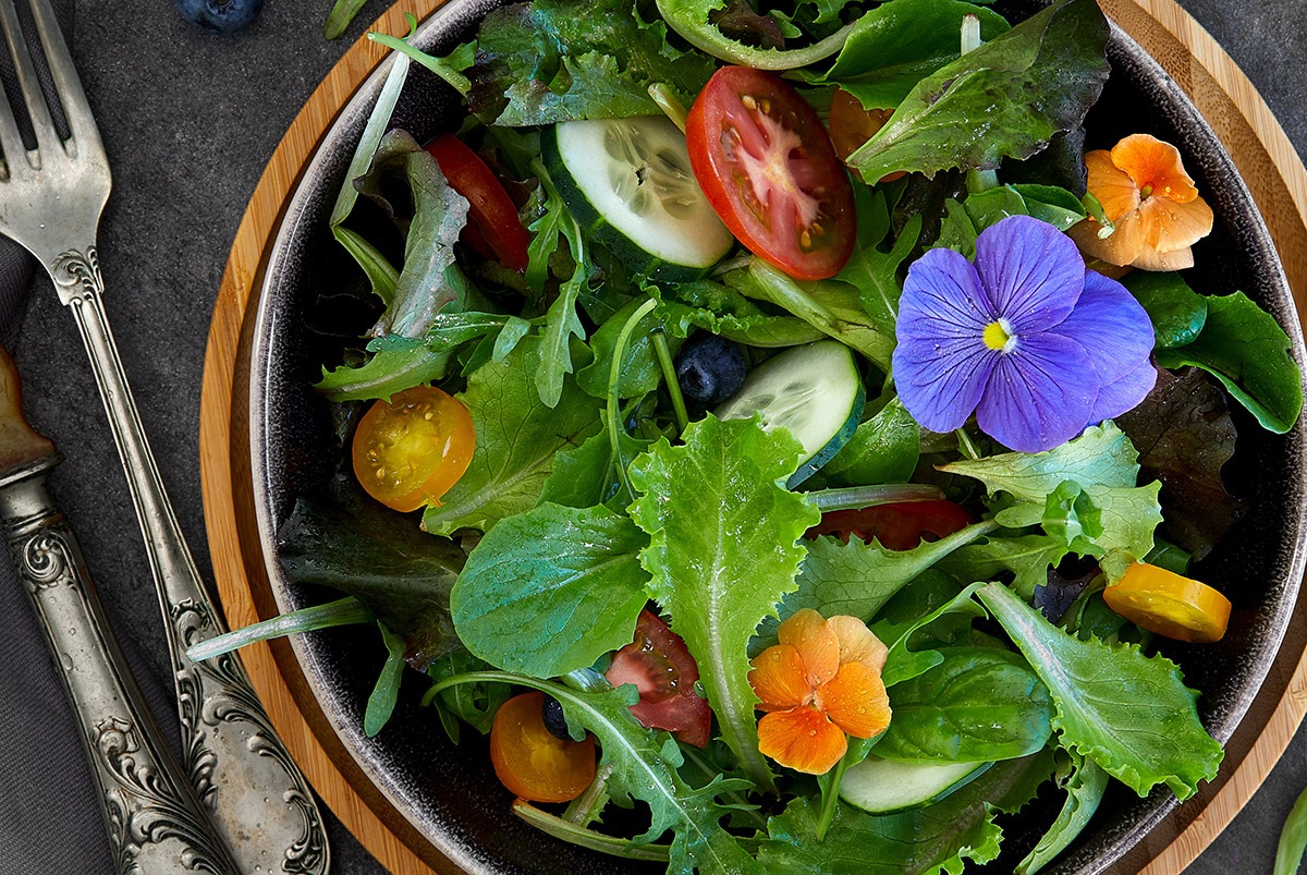
Food photography is an art that demands not only technical skill but also a creative eye for composition. A key ...